Client: Argent
Location: London
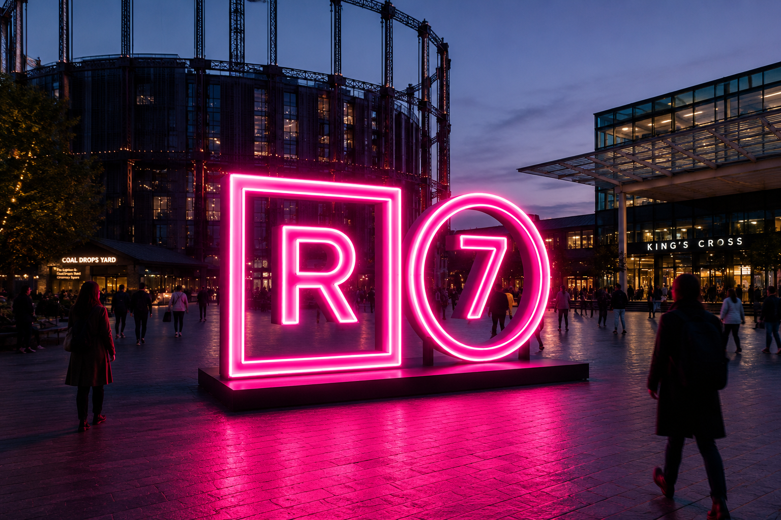
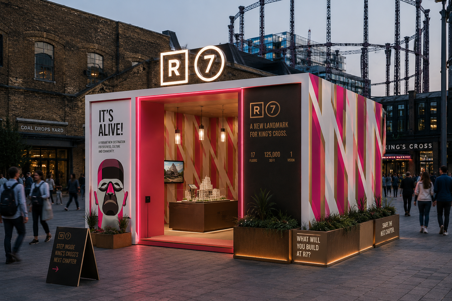
R7—A new identity with landmark ambitions
R7 was one of King's Cross' most distinctive office developments, designed to attract a new generation of businesses to one of London's fastest-changing neighbourhoods. The challenge was to create a brand that celebrated the building's bold architecture while giving it a personality that stood apart in an increasingly competitive commercial property market.
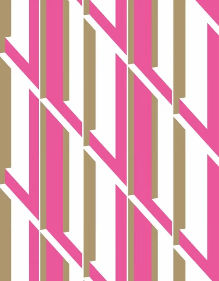
Beginning with an intentionally unexpected name, the identity embraced the confidence and character of the building itself. Inspired by its striking pink façade, the creative combined bold typography, vibrant colour and a confident graphic language that carried seamlessly across every touchpoint, from launch campaigns and leasing materials to environmental graphics and digital experiences.
The result is a brand as distinctive as the building it represents, transforming R7 from a commercial development into a memorable destination with an identity all of its own.